The announcement of Google workspace brings with it a restyling of icons that identify some of the most important and used services in bigG's offer: the new ones have been designed to conform in style, in a way not too dissimilar to what Microsoft recently did, which for its entire catalog has redesigned the logos following the principles of Fluent Design.
New icons for Gmail, Calendar, Drive, Docs and Meet
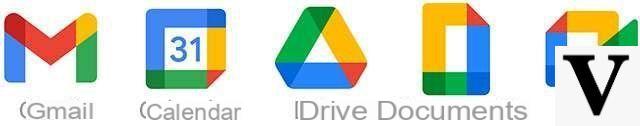
They are affected by the new look the e-mail of gmail, the agenda of Calendar, the space of Drive on the cloud, files created and managed via Documents and meetings on Meet. In all likelihood, others will follow later. The result is the one visible in the image below: simple shapes created by the intersection of the four colors that from the first glance recall the identity of the Mountain View group.
As often happens in these cases, the rollout it will be gradual. Here is what we read in the official press release that today reveals the news.
In the coming weeks, users will be able to see new four-color icons for Gmail, Drive, Calendar, Meet and tools for creating collaborative content such as Documents, Sheets, Presentations, just to emphasize belonging to the same family and to represent the Google Workspace's commitment to creating a seamless communication and collaboration experience that can be useful to people, in line with the spirit of Google.
Workspace is in fact theevolution of G Suite, developed with the declared aim of offering a "highly integrated product experience", throwing a gauntlet to competitors (Microsoft primarily) and underlining the solidity of the offer that Google offers to professionals in terms of productivity tools . Also there new brand identity it is part of this path.
Source: Google Workspace: New icons for Google services